Overview
As a UX Designer, I contributed to Phase 2 of a multi-phase initiative with Blue CoLab and Pace University to create an interactive kiosk powered by IoT-based real-time water quality data.
My focus was on transforming continuous sensor data into an intuitive, engaging interface that helps students easily understand the Water Quality Index (WQI) and promotes greater awareness of local water quality on campus.
The Strategic Challenge
Access to water quality information is critical for informed health decisions. On university campuses, students often consume tap water without any knowledge of its quality or source.
The core challenge was one of translation:
How might we transform complex, real-time sensor data into an engaging and accessible format that encourages awareness and informed choices?
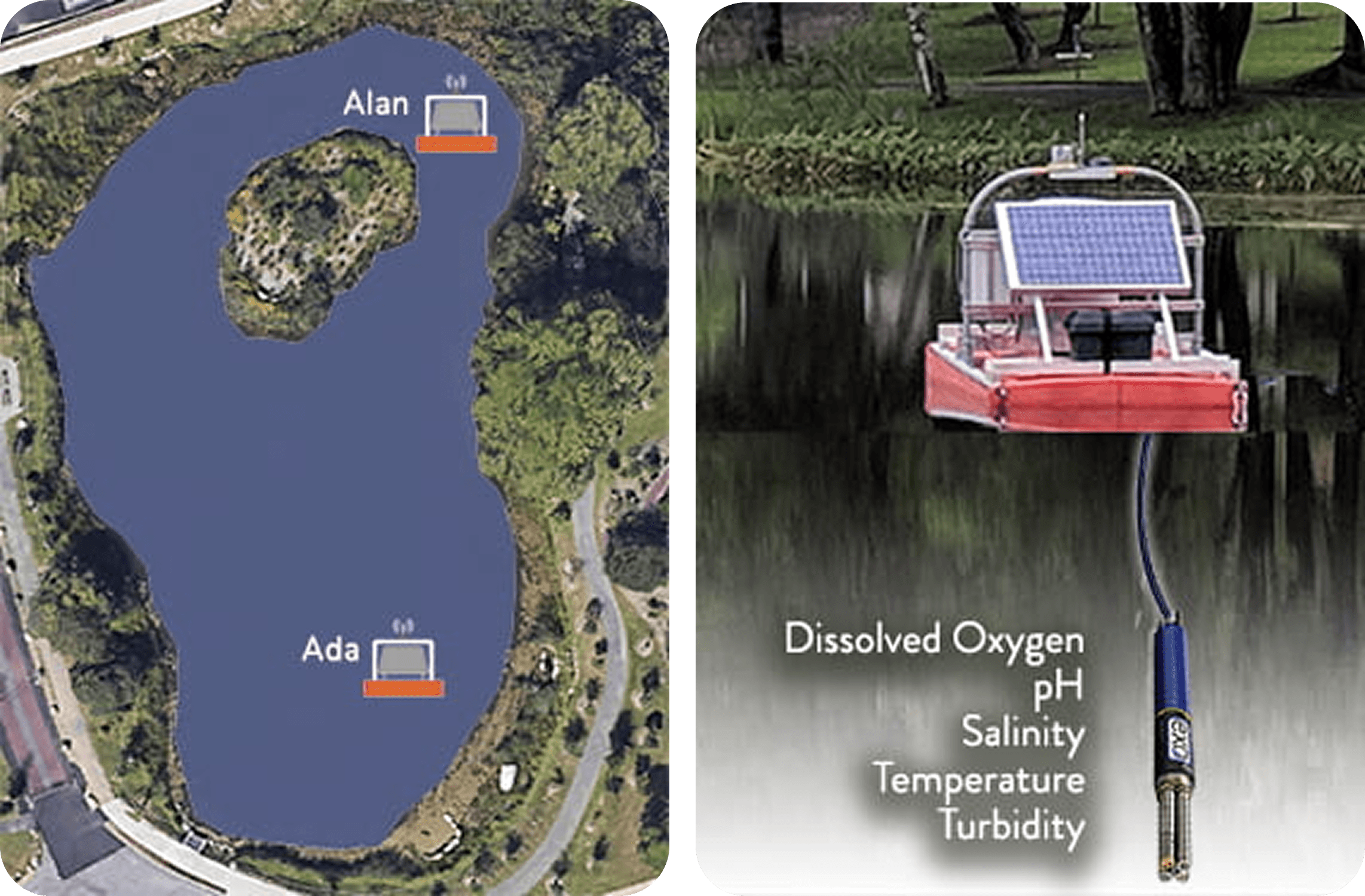
Meet ADA & Alan, monitoring stations in pond Chaotte on Pace University Pleasantville Campus
Leading the Research Initiative
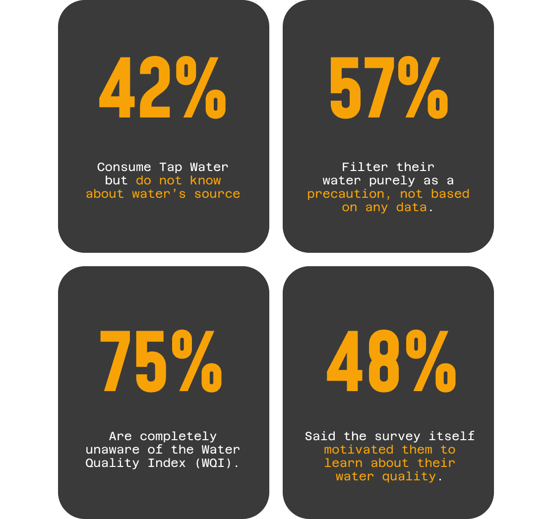
To ensure a human-centered approach, I directed a generative research study to understand student habits and (un)familiarity with water quality. We collected 45 survey responses and conducted 10 in-depth user interviews.
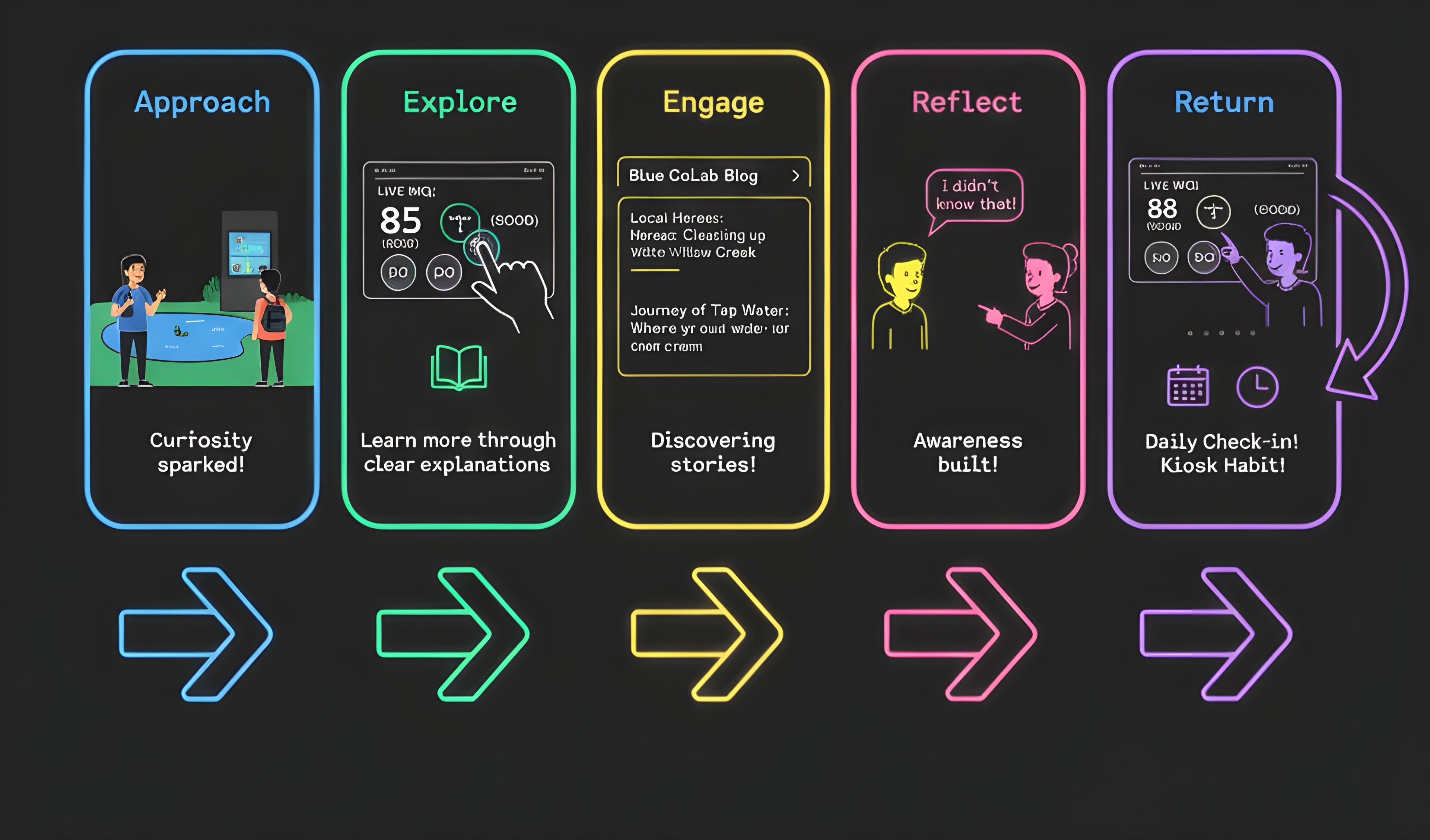
Mapping the User Journey
Understanding the student's path from ambient curiosity to active learning was key to designing an intuitive flow for the kiosk.
Synthesizing the Data
Strategic Takeaway
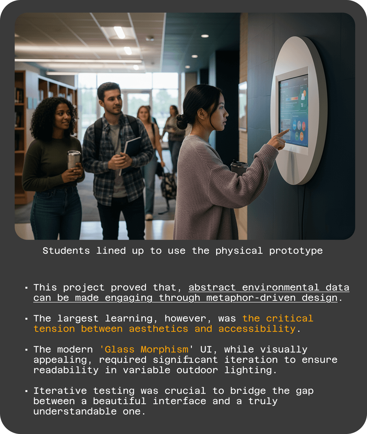
"Our initial assumption was that students wouldn't engage with environmental data. Research proved the opposite: awareness can be triggered through accessible, engaging design."
My Leadership in the Process
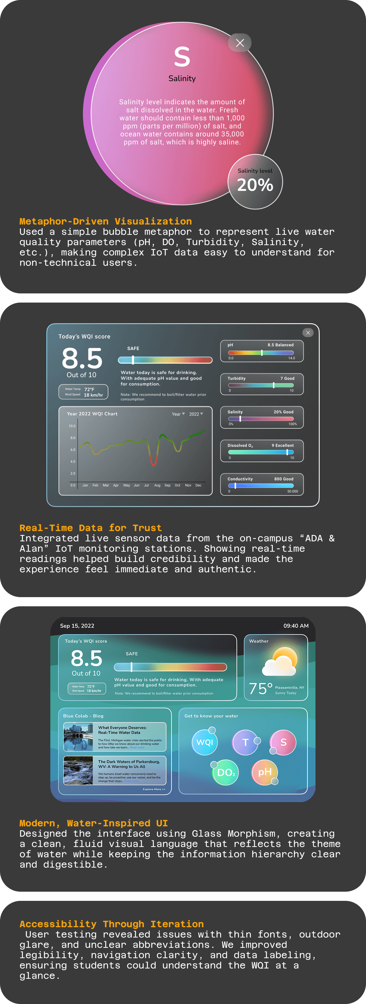
Key Design Decisions
User Interface Video of the prototype
Business & User Impact
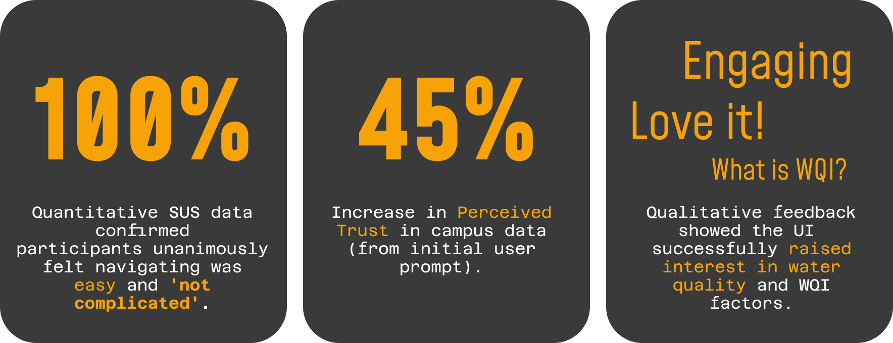
The design strategy successfully translated complex data into a tool that was quantifiably easy to use and qualitatively engaging, sparking community discussion and awareness.
Learnings & Key Take Away: